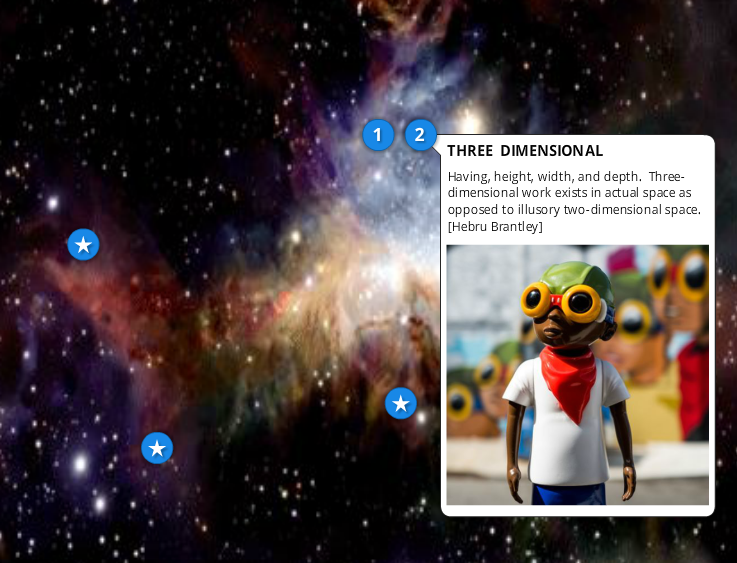
 As an instructor of art + design, I'm always trying to make my students' experience more engaging and sticky. I'm always re-writing exercises, trying out new ones, and asking the students themselves how they'd like to experience something. One of the required components of my Foundations Making class, which a wide range of 1st-year students must take - from fine arts to fashion design majors - is an unwieldy and intimidating glossary of terminology that covers every aspect of the visual arts professions. It's presented as 4 pages of text in a Word document. Ugh. Few of the students become familiar with even a portion of these terms, and most seem to consider this a grueling exercise that doesn't contribute to their talent as a budding creative. As a highly visual person, I know I love learning by seeing how something looks or works. Clearly I had to do something about this dead page of text, that was rich with visual concepts. I also wanted to steer them to solid executions of each term, and also turn them onto some really influential current artists and designers. My new glossary would have to be highly hip, and full of animated interactions that didn't present all the terms in the same way, over and over. Click the image above for the whole experience, or the the image below to see an animation I did within it. 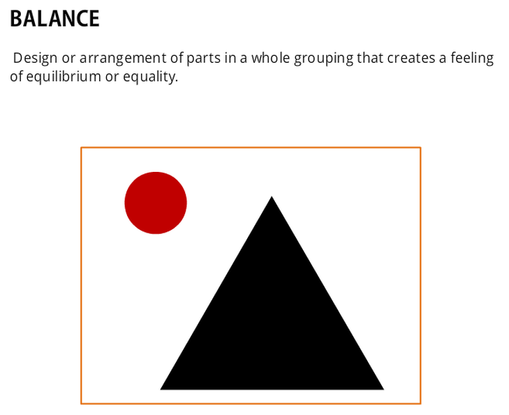
0 Comments
|

Carl BoydMusings from the world of eLearning Development and Training. Archives
October 2020
Categories
All
|
 RSS Feed
